 This was a class competition to design a logo for the KEC music department, so it could be printed on hoodies. It looks alright, I liked the headphone cord that underlines the words, except I feel it doesn't really represent the department as a whole very well.
Monday, June 21, 2010
KEC Music Logo
This was a class competition to design a logo for the KEC music department, so it could be printed on hoodies. It looks alright, I liked the headphone cord that underlines the words, except I feel it doesn't really represent the department as a whole very well.
Saturday, June 19, 2010
3D Movie Poster
 This was an extra project that we could do if we had time. We had to make a movie poster in the 3D program. I couldn't really think of much so I chose this idea, kinda weird, but whatever. I made MJ in 3D with not much instruction or introduction to the gadgits that are used for making people, so Mr. T told me to just used 3D shapes. Its okay, considering its made from shapes.
3D Bottle Project
 This project was made in a 3D animation program, and we were supposed to design a 3D bottle with a name, adjust the lighting, etc, etc. Mine turned out not bad.
About page
 this was the weakest page of the three, it was a bit difficult to make a bunch of text the least bit interesting.
The Latest Page
 I forgot to mention that this was a site that we were to created, based on a real site we thought could be improved on. Aritzia is a clothing store. This was another page.
Aritzia website front page
 This was the front page of a website we made 4th period in graphics with Mr.T.
It turned out not bad, the coolest part being the menu that was a belt, haha.
Car Show Poster
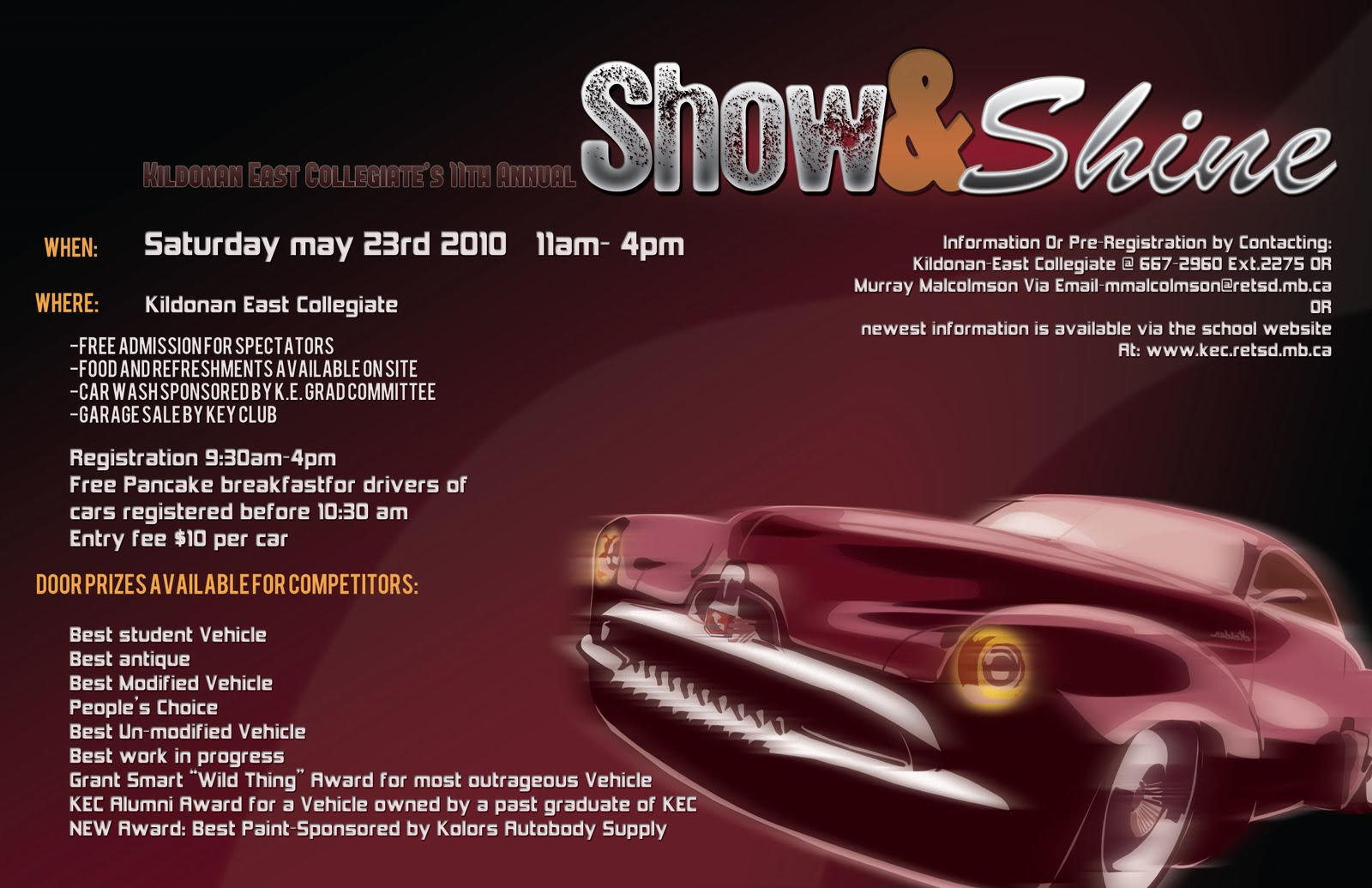 A class competition yet again. Unfortunately, I worked on it too long and I handed it in after the autotech teacher decided on one. But anyways, I still love how it turned out! I vectored the car (and yes I chose an older model, because...well thats what's cool to see at a car show like that, plus they're nicer) and copied it to a few layers to blur them a few ways to make it look like it was actually in motion. It turned out cool, even the fonts. I also incorporated the school colours.
Colour Project
 This was probably my best result for a project. It took a really long time for each vector, but they got easier and faster as I went along. I loved making them to a colour scheme, it made them look so cool! My favourite vectors were: obviously the huge Brooke Shields, Macaulay Culkin, Young MJ, and Donny Osmond. It was surprising how things came together when they were composed of such weird colour combos.
Flag Project
 This was a pretty simple project, and it was kind of enjoyable as well. It turned out pretty nicely, my favourite flags being the new Canadian flag, and the roxy business flag. They look pretty cool.
KEC Student Handbook
 Another class competition, and another project that wasn't a fave. I guess I need more time for things to be satisfied with my work.
Gestalt Art
 This was the very first project I did from 1st semester with Mr. C. We were supposed to make random graphic art using only circles, squares and lines. We had to make 4 different ones for each shape. I think they turned out pretty interesting, my favs being the top squares, the pinkish looking squares in the middle and the purply lines at the bottom.
Vinyl Decal
Our project assignment was to make a vinyl decal that we could print, and apply to an object of our choice. Well, my first impression was that we were supposed to just vector something, then "apply" it to a picture like on photoshop, so I decided on the apple tree, and I was planning on super-imposing it on an apple laptop. But then I found out that we were actually making a decal! So I just bought a water bottle to put it on, since I couldn't really think of anything else I wanted it on. I think it looks really pretty on the red bottle.

Graphic Design Poster
This is my graphic design poster, which we had to correlate it to a quote. When I thought of this idea, it seemed so good, but then when I was doing it, it really didn't seem that great. But actually, now that I am done it, it actually isn't too bad, it seems to look nicer in print. My ideas for this was to have this poster like the guy who wrote this quote made it. It relates to the quote, because its like its a crappy crumpled thing that he thought was a mistake, but afterall, it was a great thing. Actually, thats kinda how this project really was.


Page Layout- Magazine Spread
This was my magazine page layout spread. I had some troubles with the cup ( i used a different image in the beginning) being blurry, so I found this other picture instead. With the cup, I edited it on photoshop, selecting the tea, copying it to a different layer, deleting the original tea, then on the new layer, I changed the hue to a greenish colour, because I couldn't find a nice high quality picture with actual green tea inside! In the end, I really like how this turned out, it actually looks like something that could possibly be in a magazine!:)


PRIDE Calendar
This my calender, which as you can see by the way it looks, it folds up to be a standing calendar. It was a pretty neat project. We needed to choose a program or something of that sort that we were involved in, and make a business calendar for it. I was originally making it for the Victory in Europe trip, but then I chose to make it for the basketball team I was on at the time. There was no logo large enough, and it got very blurry when I resized it, so I had to vector the logo. All in all, I feel this project turned out really nicely. I love the contrast between the top and bottom half.

Thursday, June 17, 2010
Drink Labels
These were the labels we made for drink cans. I like the way they turned out, but the colours could have been a bit darker.


Subscribe to:
Posts (Atom)